
September 9, 2017
About 11 minutes
Visualization Images Compression JPEG STEM 
How JPEG works
Interactively explore JPEG’s lossy compression methods
Contents
Introduction
In the world of technology, “forever” means about 5 years. It’s humbling to think that the 1992 JPEG image standard is still going strong despite being more than 5 “forevers” old. Why has it been so successful? This article presents the key ideas behind JPEG in plain language and includes an interactive JPEG compressor right on the page so you can play along at home.
Compression methods
Compression techniques look for repeated patterns in the data and then replace those patterns with shorter ones. It’s like using an abbreviation or acronym to stand in for a longer word or phrase. Video, still images, and audio don’t usually compress well. The problem with images and sound is that this data is usually too noisy to find good abbreviations. For this reason, JPEG and many other media formats use something called lossy compression.
Lossy compression means that you reduce file size by throwing away some of the information. Suppose a librarian has run out of shelf space and needs room for more books. If she replaces some of the books with digital or microfiche copies, that’s lossless compression. If she burns some of the books, that’s lossy compression.
It’s not the notes you play, it’s the notes you don’t play. Miles Davis
The trick to good lossy compression is to throw away information that nobody cares about: burning the books that nobody ever reads. How to decide what to keep? Science! In the case of image compression, you start by understanding which parts of an image are important to human perception, and which aren’t. Then you find a way to keep the important qualities and trash the rest. In JPEG, the lossy compression is based on two psychovisual principles: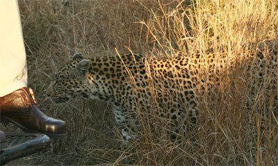 A leopard walks in partial camouflage near a vehicle in South Africa. Credit: Lee R. Berger.
- Changes in brightness are more important than changes in colour: the human retina contains about 120 million brightness-sensitive rod cells, but only about 6 million colour-sensitive cone cells.
- Low-frequency changes are more important than high-frequency changes. The human eye is good at judging low-frequency light changes, like the edges of objects. It is less accurate at judging high-frequency light changes, like the fine detail in a busy pattern or texture. Camouflage works in part because higher-frequency patterns disrupt the lower-frequency edges of the thing camouflaged.
JPEG compression applies each of these ideas in turn. In each case, the image data is transformed to give easier access to the kind of information needed (either brightness or frequency information). Then some of the less important information is discarded. As a final step, the information that is left is compressed with traditional lossless compression to pack the end result into the smallest space possible. In this article, we explore the process step-by-step, using real images and following them through the entire encoding (saving as JPEG) and decoding (loading from JPEG) process. You can play with the encoding settings and see how it affects the results. Let’s go!
Encoding
Start by choosing an input image to compress.
Choose an image from the list provided. There are several to experiment with, but I recommed that for your first time through you use the default “Tower” image. It has a good mix of low- and high-frequency segments, and I’ll refer to it sometimes in the article text.
You can also use an image of your choice by selecting Choose your own image or by dragging and dropping the image file on this page.
 An image is made of pixels. The colour of each pixel is the sum of amounts of red, green, and blue light.
Typical computer images are made up from a grid of tiny coloured squares called pixels. Each pixel is stored as three numbers, representing the amount of red, green, and blue light needed to reproduce that pixel’s colour. For this reason, it is called an RGB image. On the left side of the left-hand illustration, you can see the red, green, and blue parts of your selected image split out into three separate channels.
The problem, as far as JPEG is concerned, is that the image’s brightness information is spread evenly through the R, G, and B channels. Remember that brightness is more important than colour, so we’ll want to isolate brightness from the colour information so we can deal with it separately. To do this, JPEG uses some math to convert the image’s colour space from RGB to YCbCr. A YCbCr image also has three channels, but it stores all of the brightness information in one channel (Y) while splitting the colour information between the other two (Cb and Cr).
The right side of the left-hand illustration shows the same image split into Y (top), Cb (middle), and Cr (bottom) channels. Notice that the Cb and Cr channels are “muddy” because all of the definition given by the brightness information has been moved to the Y channel.
To keep the size of the illustration reasonable, I have scaled down all of the channels. In reality, each one is the same size as the original image.
Y
Cb / Cr
Before doing anything else, JPEG throws away some of the colour information by scaling down just the Cb and Cr (colour) channels while keeping the important Y (brightness) channel full size. Strictly speaking, this step is optional. The standard says you can keep all of the colour information, half of it, or a quarter of it. For images, most apps will keep half of the colour information; for video it is usually a quarter. For this demo I’m keeping a quarter, both to exaggerate the effect and because it makes for nicer illustrations.
Notice that we started with 3 full channels and now we have 1 full channel and 2 × ¼ channels, for a total of 1½. We’re just getting started and we are already down to half of the information we started with!
Step 3: Convert to the frequency domain
Y'
Cb' / Cr'
To make use of the second observation about human visual perception, we start by dividing each of the Y, Cb, and Cr channels up into 8×8 blocks of pixels. We will transform each of these blocks from the spatial domain to the frequency domain.
Whoa there, horsie! What? OK, let’s consider just one of these 8×8 blocks from the Y channel. The spatial domain is what we have now: the value in the upper-left corner represents the brightness (Y-value) of the pixel in the upper-left corner of that block. Likewise, the value in the lower-right corner represents the brightness of the pixel in the lower-right corner of that block. Hence the term spatial: position in the block represents position in the image. When we transform this block to the frequency domain, position in the block will instead represent a frequency band in that block of the image. The value in the upper-left corner of the block will represent the lowest-frequency information and the value in the lower-right corner of the block will represent the highest-frequency information.
This domain transformation is accomplished using a bit of mathematical legerdemain called the 2D Discrete Cosine Transform (DCT). (If you have heard of Fourier transforms, the DCT is similar but it uses only real numbers; this is more convenient for computer representation.) The essential idea is to represent the values in the 8×8 block as a sum of cosine functions, where each cosine function has a specific unique frequency.
You don’t need to understand the math to get a sense of how it works. Look at the Y frequency illustration for the Tower image. You can clearly see each 8×8 block’s upper-left corner thanks to a dark dot of low-frequency information. Now if you look at blocks from the sky parts of the image, you will see that the rest of each block is mostly empty. The sky doesn’t have lots of dramatic changes from pixel to pixel: no high-frequency information. Compare that to blocks from the tower parts of the image: the busy texture of the bricks means lots of higher-frequency change, and this shows up as grey throughout the block.
Step 4: The quality slider (quantization)
The next step is to selectively throw away some of the frequency information. If you have ever saved a JPEG image and chosen a quality value, this is where that choice comes into play. It works like this: start with two 8×8 tables of whole numbers, called the quantization tables. One table is for brightness information, and one is for colour information. You will use these numbers on each of the 8×8 blocks in the image data by dividing the frequency value in the image data by the corresponding number in its quantization table. So the upper-left corner of each 8×8 block in the Y frequency channel will be divided by the number in the upper-left corner of the brightness quantization table, and so on. The result of each division is rounded to the nearest whole number and the fractional parts are thrown away.
Quantized Y'
Quantized Cb' / Cr'
Output
| Luminance (brightness) table |
|---|
| Chrominance (colour) table |
|---|
The effect of your choice on the final output image is shown for reference.
The larger a number in one of the quantization tables, the more information gets thrown away from that part of that frequency range. Since we care less about high-frequency information, the numbers in that area of the quantization tables will be larger. And since we care less about colour than about brightness, the numbers in the colour table will be larger overall than the numbers in the brightness table.
The quantization tables are saved along with the image data in the JPEG file. They’ll be needed to decode the image correctly.
Go ahead and play with the quality slider above. Notice how more and more of the frequency information disappears as you drag the quality down towards the low end.
Step 5: Lossless data compression
If you think carefully about what just happened, you will realize that even though we threw away some frequency information by tossing the decimal parts after division, we still have the same amount of data: one number for each pixel from each of the three channels. It seems like that step didn’t actually buy us anything. However, this data is now going to be compressed using traditional lossless compression. But wait, wasn’t the whole reason we used lossy compression in the first place that lossless compression doesn’t work well for images? Yes, but that quantization we just did is going to make the data more compressible by making it less noisy. To see why, compare these three number sequences:
   n = 0, 1, 2, 3, 4, 5, 6, 7, 8, 9, 10, 11, 12, 13, 14, 15, 16, …
 n/2 = 0, 1, 1, 2, 2, 3, 3, 4, 5, 5,  5,  6,  6,  7,  7,  8,  8, …
n/16 = 0, 0, 0, 0, 0, 0, 0, 0, 1, 1,  1,  1,  1,  1,  1,  1,  1, …
 Block data is compressed in zig-zag order, grouping similar frequencies together.
The first row lists values for, say, some pixel in the Y frequency channel. The second row is the same values divided by 2 and rounded; the third row is divided by 16 and rounded. You can see that the larger the divisor, the more repetition there will be in the data. And the more repetition there is in the data, the easier it is to compress, and the smaller the final image file will be.
JPEG has one last trick for making the data more compressible: it lists the values for each 8×8 block in a zig-zag pattern that puts the numbers in order from lowest frequency to highest. That means that the most heavily quantized parts (with the largest divisors) are next to each other to make nice, repetitive patterns of small numbers.
Decoding
There you have it, the essential elements of writing a JPEG image: convert the image from RGB to YCbCr so we isolate the brightness, throw away some of the colour, convert to the frequency domain, throw away some of the precision of the frequency information, and compress the resulting data.
What happens when you read an image back in? Essentially you just need to reverse each step of the encoding process. Let’s step through it.
Step 6: Decompression
Quantized Y'
Quantized Cb' / Cr'
The first step is to decompress the quantized (divided and rounded) frequency data. Since this data was compressed losslessly, the result will be exactly the same as in Step 5 above.
Step 7: Reconstruction from quantized data
Y'
Cb' / Cr'
Next we need to reverse the quantization process. We use the same procedure as before, but instead of dividing by the numbers in the tables, we multiply. Since we rounded the numbers, we won’t get exactly the same numbers back. The result is an imperfect approximation of the original frequency data, limited to the precision allowed by the quantization tables. The lower the quality, the larger the quantization divisiors, the more precision is lost, and the less accurate our reconstruction will be now.
Step 8: Convert back to spatial domain
Y
Cb / Cr
Now that we have reconstructed the frequency information, we need to transform it back from the frequency domain to the spatial domain. This is no problem. The transform that we used during encoding has an inverse that does the job.
Now that the data is in a more recognizable form, we can start to judge how perceptible the information loss is.
Cb
Cr
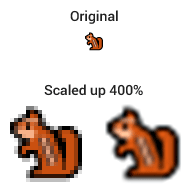 A chipmunk graphic is scaled up by 400% using two different methods. One scaled image is blocky, the other blurry.
In order to combine the channels back into a single image, we need to scale the two colour channels Cb and Cr back up to their orignal size. But the information we threw away is gone, so we will have to approximate it with interpolation. We will fill in missing pixels by taking an average of the surrounding pixels that are still there. There are different ways to do this, and none of them is perfect. The scaled up image will tend to be either blocky or blurry, depending on the method used.
Step 10: Convert back to RGB
At this point we have a complete image, but it is still in the YCbCr colour space, which a computer can’t display directly. We need to transform it back to the RGB colour space that we started with.
The output image
Input
Output
Difference
Finally, we can combine the separate R, G, and B channels back into a single image and display the result. For comparison, both the original input image and the decoded output image are shown at left. Below that is a “difference image” that highlights discrepencies between the two: darker pixels mean the output varies more from the input at that location.
There you have it. We have taken an input image, encoded it, decoded it, and gotten a similar image back. That’s JPEG. Now that you’ve seen the whole process, go back and experiment with some of the other images.
Have a comment or correction? Let me know! I don’t use an automated comment system on this site, but I do appreciate feedback and I update pages accordingly.